UI REDESIGN
A comic book website

The website

The MakingComics.com website is a graphic novel teaching project, an online ressource and a community.
My goal was to turn a content-heavy landing page into something more visually engaging and easier to use while respecting the overall visual identity.
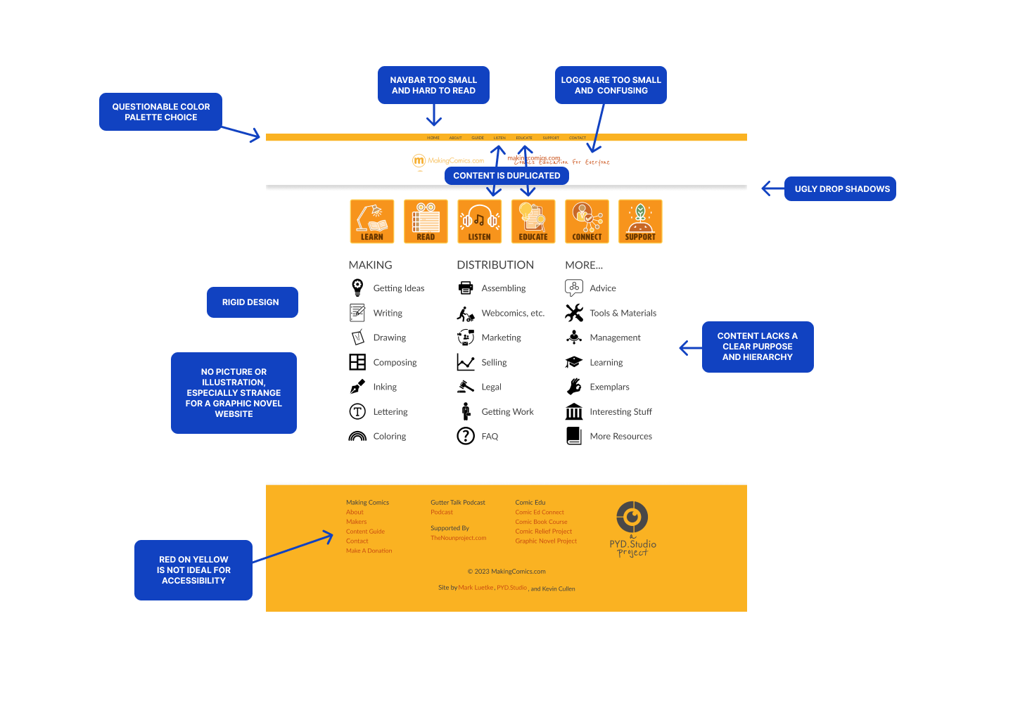
The problem
Design solution
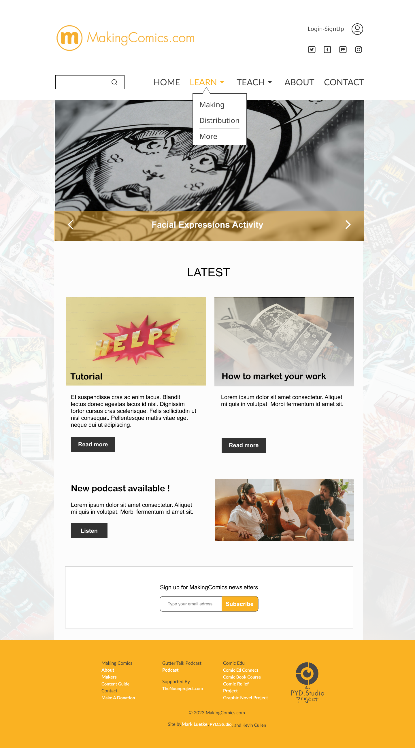
1. I made the logo more prominent so the user can distinguish the brand fast
2. I added social media icons to develop the community aspect of the website and create engagment.
3. I simplified the nav bar and made it bigger. Previously repeated information can be accessed through drop down menus instead.
4. Since the website has a lot of content, I added a search bar to allow direct access to information.
5. I added a hero section and some sub sections with images to make the landing page more visually appealing and create a hierachy of information that was lacking initially.
6. I took the liberty to add a newsletter’s subscription box to promote the content.